If Your Label Looks Like This, You’re Losing Sales
You could have the best damn formula in the world — clinically dosed, flavor dialed, QC tighter than Fort Knox — but if your label looks like it was whipped up in Microsoft Paint, guess what? You’re losing sales. Period.
But first…
Meet the First 18 Challengers of the Supplement Showdown
Before anything else, we want to give a massive shoutout to the current 18 competitors who’ve stepped up to throw their hat in the ring:
Tyan Boyer, Jing Yi, Carter Vice, Bryson Parker, Joe Adams, Jovic Tuquero, Bethanny Moore, Blake Foster, Ryanne Carl, Nicholas Becker, Ethan Tosolt, Don Nickerson, Carson Adams, Michael Hernandez, Benjamin Allen, Chris Jenkins, Dylan Burk, Pedro Luis Ruíz Covarrubias.
From never-before-seen flavor combos to performance stacks that push the limits of what a pre-workout can do, these innovators are here for one reason: to Rival the Competition.
Think You Can Do Better? Prove It.
Here’s how to throw your name into the ring before the deadline:
01. Fill out the form on our website with your supplement idea.
02. Follow @V1Nutra & @RivalLabs on TikTok & Instagram.
03. Like, comment, and share the launch post.
04. (Optional) Upload a video pitch for extra clout — go all in and show us why your idea deserves to win.
Final Call: Entries Close 8 October 2025
Once the doors close, the lineup is locked. No second chances. Submit your concept and see if you’ve got what it takes to go head-to-head with the best.
Our Competitors Understand: Shelf Space Is War
Walk into any store. What do you see? Walls of tubs screaming for attention. Neon this. Chrome that. Logos stacked like graffiti. You’ve got three seconds to grab someone’s attention before they pick the tub next to yours. If your design doesn’t punch them in the face with confidence, you’re invisible.
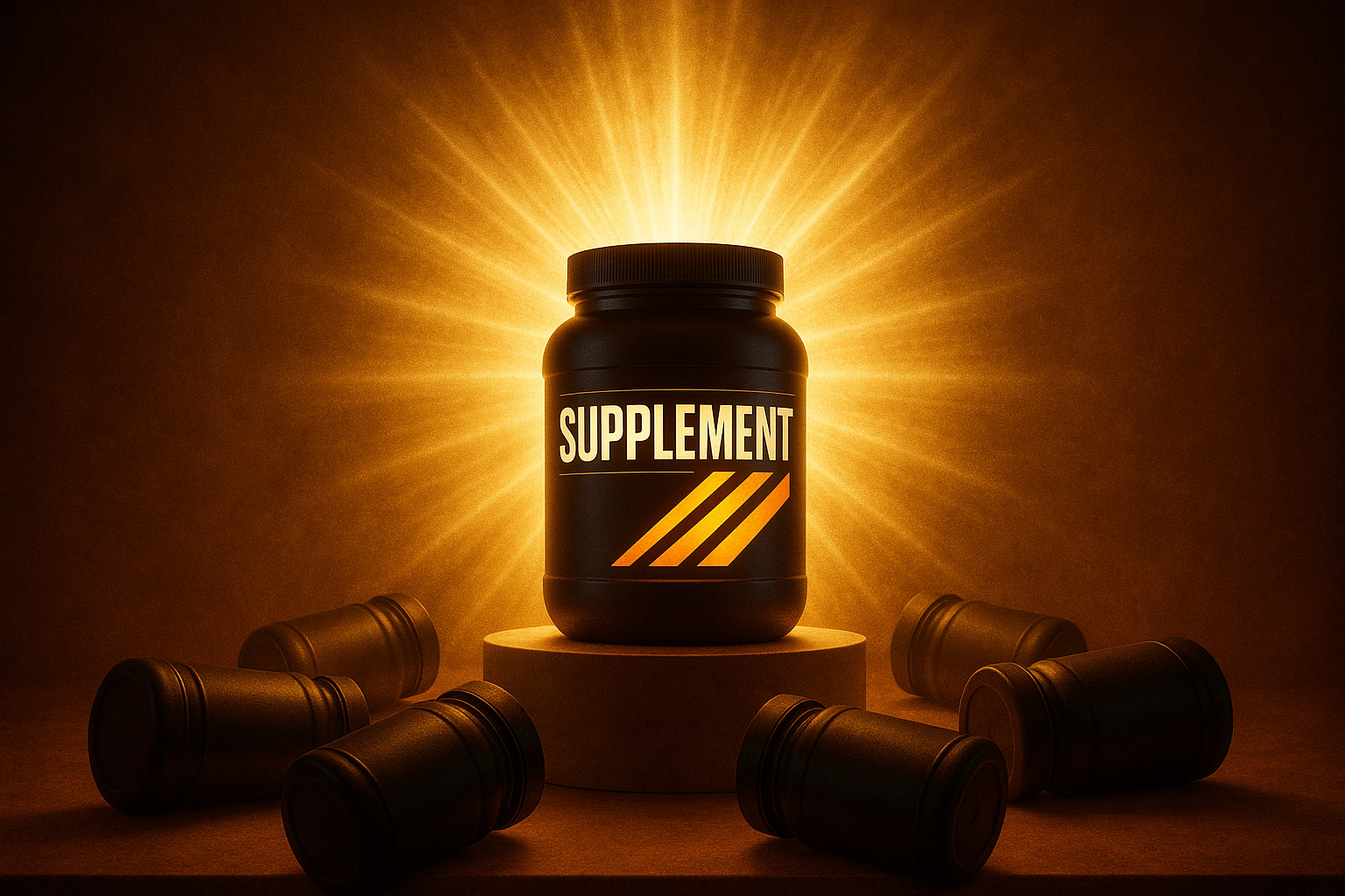
Red Flags That Kill Your Sales
- Overloaded Labels – If your design reads like a textbook, no one’s reading it. Customers buy vibes first, details later.
- Copycat Branding – If your tub looks like every other black-and-red “hardcore” pre-workout, you’re just another face in the crowd.
- Font Chaos – Ten fonts on one label? Congrats, you just made a ransom note.
- No Story – Your design has no hook, no identity, no why. You’re selling powder in a tub, not a brand.
Design Isn’t Just Pretty — It’s Profit
Design isn’t about being “cute.” It’s a weapon. It builds trust, drives recognition, and creates loyalty.
Where Rival Labs Clients Win
We don’t just slap formulas into tubs and wish you luck. We connect brands with design teams who understand the industry and the difference between just a label and a money-printing machine.
We’ve seen bold redesigns take brands from collecting dust to selling out.
Hard Truth
If your label looks cheap, your product feels cheap. If it looks like everyone else’s, you’re just another tub in the pile. And if it looks like chaos, you’re scaring off buyers before they even touch the scooper.
Your formula deserves better.
Your brand deserves better.
Your bottom line demands better.
At Rival Labs, we don’t just manufacture supplements — we build brands that sell.
The Showdown is your chance to prove you belong at the top. The label is your chance to make sure you stay there.
Now go build something worth picking up.